Ditch the Label
Ad Design | Photoshop
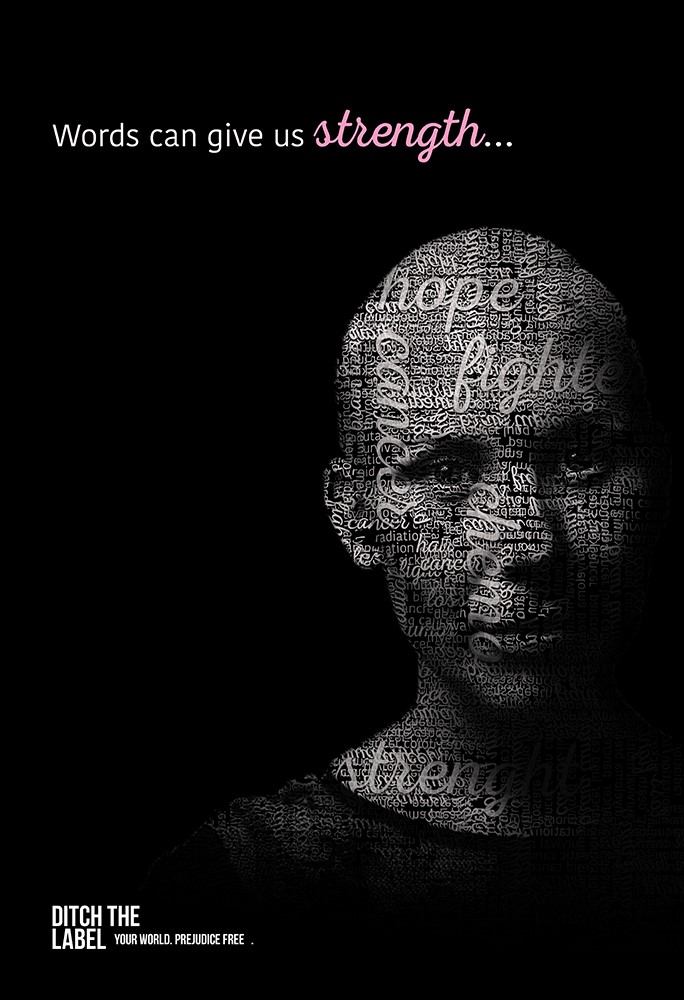
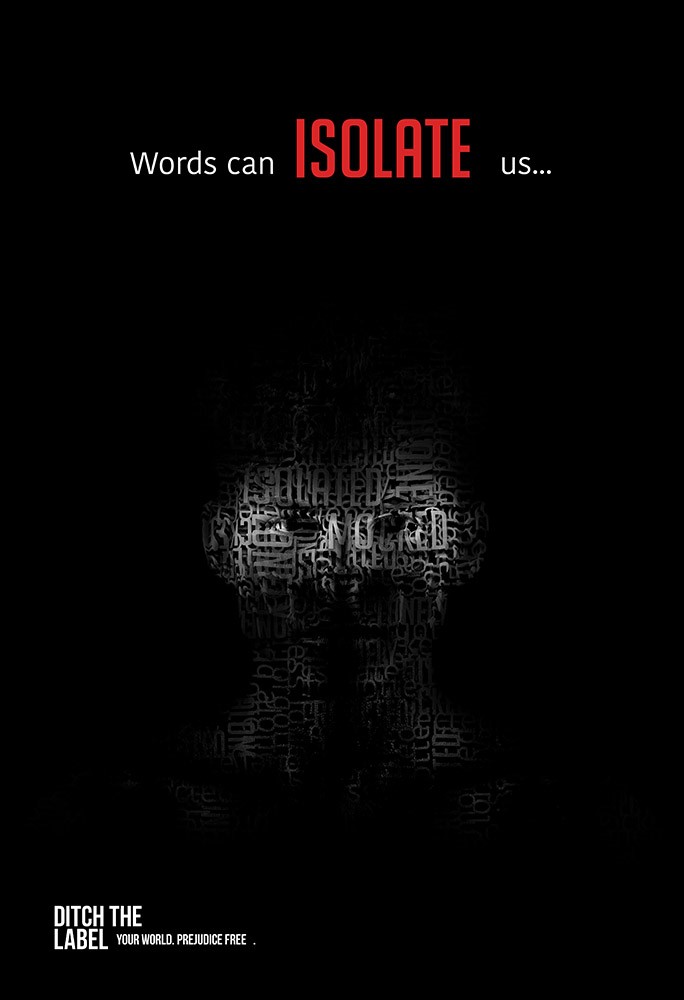
For my Ad Design course during my undergraduate at Delta State University, I was tasked with designing a PSA ad campaign for my chosen organization – Ditch the Label. My goal when designing this ad campaign was to make a dramatic and powerful visual impact on the viewer to demonstrate the effect words can leave. I chose positive and negative words and collected subwords that complement each other.
The majority of the ad is black and white, which draws the viewer’s eye to the spotlighted portrait, which is comprised of text in various forms of typography. The mixture of typography in each ad increases the impact and is meant to accentuate the chosen word. I chose to use various colors for my positive words to demonstrate the varying degrees of positivity that words can provide. Adversely, I chose to accentuate the negative words with only red, which is often viewed as a harsh and violent color, to demonstrate the ultimate negative connotation that can be received.
Get In Touch
(662) 588-1631


